
Paint Colour Trends: Celery and Colours to Watch
7 min read
1367 words
Choosing a new paint colour can completely change how a room feels. Sometimes all it takes is a fresh coat of paint to make a space feel brighter, warmer or simply more like your own. The paint colour trends for 2027 are moving away from some of the cooler, harder looking shades we have seen in recent years. There is more interest in colours inspired by nature, warmer neutrals and shades that make a home feel comfortable and lived in. One colour already getting plenty of attention is Celery, which Sherwin Williams has selected as its 2027 Color of the Year.
Why Celery is getting attention
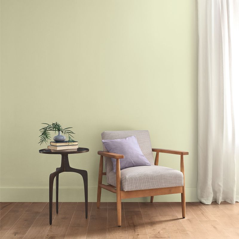
Celery SW 6421 is a soft, muted green with warm yellow undertones. Sherwin Williams describes it as an airy, herbal green, and it is part of the company’s 2027 colour forecast.
It is quite different from the darker forest and emerald greens that have been popular in recent years. Celery is lighter and easier to use throughout a room without making the space feel dark.
It could work particularly well in a kitchen, bedroom, bathroom or home office. It also gives homeowners a way to bring some colour into their home without going for something extremely bold.
If you are nervous about using green on all four walls, consider using it on one wall or in a smaller room first.
Green is not going away
Celery is not the only green worth watching.
Green has been showing up in everything from kitchen cabinets and living room walls to bedrooms and bathrooms. Sage, olive, moss and other muted botanical greens can work well with wood, natural fabrics and warm metals.
One reason green continues to appeal to homeowners is that it can be surprisingly versatile. A soft green can feel relaxed and subtle, while a deeper olive or forest green can create a much stronger look.
The paint colour trends heading into 2027 suggest that nature inspired colours will continue to have a place in the home.
Warm whites are replacing stark white
White is not disappearing, but the very cool, bright whites that have been popular for years are not the only option anymore.
Warm whites, creamy whites and soft off whites can make a room feel more comfortable, particularly when paired with wood flooring, natural furniture or warm lighting.
They can also be easier to live with than an extremely bright white, especially in rooms that do not receive much natural light.
If your walls are currently a stark white and the room feels a little cold, you may not need a completely different colour. A warmer white could make a noticeable difference.
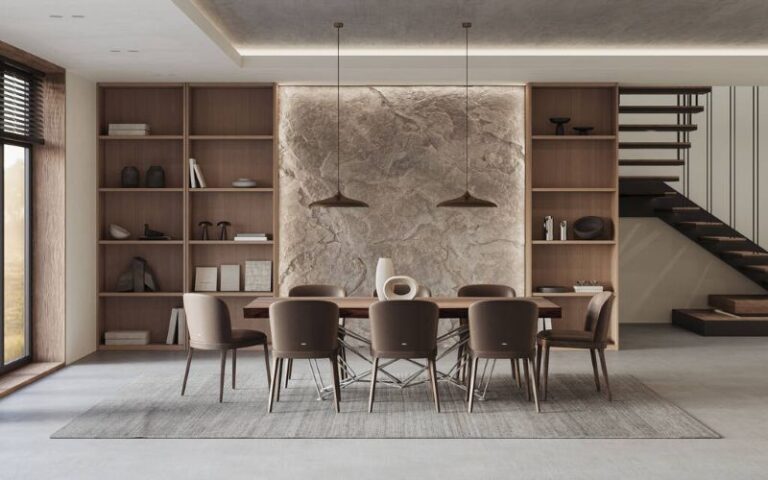
Brown is making a comeback
Brown has had something of a comeback in home decorating, and it is easy to see why.
Warm browns, mushroom shades, taupes and chocolate tones can add depth without being as dramatic as black. They also work well with natural wood and other earthy colours.
You do not have to paint an entire room dark brown. A softer taupe or mushroom shade can provide warmth while keeping the room fairly light.
For homeowners who are tired of grey walls, these warmer neutral colours offer another option.
Don’t overlook blue
Blue continues to have a place in interior decorating, particularly softer blue and blue green shades.
Pale blue can make a bedroom feel calm and airy, while deeper blue can add character to a dining room, office or feature wall.
Blue green shades are especially useful if you like both blue and green but cannot decide between them.
The key is to consider the light in the room. A colour that looks soft and welcoming in a sunny room may look quite different in a darker space.
Plum, red and purple are adding personality
Not every colour trend is about keeping things soft and neutral.
Rich plum, red and purple shades can be used to add personality to a room. These colours can work particularly well as an accent wall or in smaller spaces where you want the colour to make more of an impression.
You could also bring these shades into a room through furniture, artwork, curtains or accessories rather than painting the walls.
That can be a good approach if you enjoy changing your decorating style from time to time.
So, when is the best time to paint?
For interior painting, there is no single month that works for everyone. You can paint throughout the year as long as the conditions inside your home are suitable.
Spring and fall can be comfortable times to paint because temperatures are generally moderate and it is easier to get some fresh air into the house.
Summer can work too, although high humidity can affect drying time. Winter painting is also possible in a heated home, but ventilation and indoor humidity need to be considered.
Always check the instructions on the paint you are using. Temperature, humidity and airflow can all affect how paint dries and how the finished surface looks.
The paint colour trends may change every year, but there is no reason to rush into painting simply because a particular colour has become popular.
When should you hire a painter?
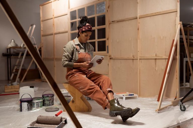
Painting one bedroom is very different from painting an entire house.
If you have several rooms to paint, high ceilings, stairwells or walls that need considerable preparation, hiring a professional painter may save you a lot of time and frustration.
A professional can also help with wall preparation, primer, choosing the right type of paint and getting an even finish.
Before hiring someone, ask for a written estimate that explains what is included. Find out whether preparation, primer, multiple coats, paint and cleanup are included in the price.
You can also split the job. Some homeowners prefer to do smaller rooms themselves and hire a painter for more difficult areas.
Test the colour before painting the whole room
This is one step that is easy to skip and can save you from an expensive mistake.
Paint a sample on the wall and look at it at different times of the day. Natural light can change considerably from morning to evening, and artificial lighting can change the appearance of a colour as well.
If possible, look at the sample on more than one wall.
A colour that looks perfect on a small paint chip may feel completely different when you see it across an entire wall.
Think about the room, not just the trend
It is tempting to choose a colour simply because it is everywhere online.
But your home does not have to look like a showroom.
Think about your furniture, flooring, curtains, artwork and the amount of natural light in the room. A colour that works beautifully in one home may not have the same effect in yours.
The best colour is often the one that works with what you already have.
You don’t have to repaint everything
Seeing new paint colour trends does not mean you need to repaint your entire house.
Sometimes one room is all you need to change.
A fresh colour in a bedroom, bathroom, entryway or home office can make the house feel different without turning painting into a huge project.
You can also update a room with painted cabinets, a feature wall or even a small piece of furniture.
Paint trends are becoming more personal
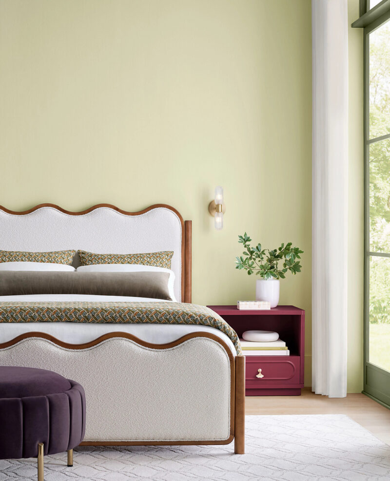
The biggest takeaway from the 2027 colour direction is that homeowners have plenty of choices.
Celery brings a soft natural green to the conversation, while warm whites, earthy browns, blues and deeper accent colours offer plenty of alternatives. Sherwin Williams’ 2027 forecast includes 48 colours, with Celery included among its Continuity Colors, which the company identifies as shades intended to have staying power beyond a short lived trend.
You do not have to follow every new colour trend. Choose something that works with your home and that you will still enjoy looking at after the paint has dried.
After all, paint colour trends can provide inspiration, but your home should still feel like your home.
Disclaimer: Paint colours can look different depending on lighting, screen settings and the surface being painted. Always test a colour in your own space and follow the manufacturer’s instructions before beginning a painting project.