
6 min read
1053 words
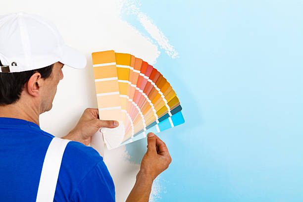
Paint is more than decoration. In a commercial space, color shapes how people feel, how long they stay, and how they perceive your brand. The right choice can make an office brighter, a café more inviting, or a store more memorable.
This guide covers the most popular paint colors being used in modern commercial interiors. Each section highlights why the shade works and where it makes sense to apply it.
1. Classic White with a Modern Twist
White remains a favorite because it makes rooms feel bigger, brighter, and more organized. Many offices, clinics, and coworking spaces use it as a base since it reflects light and helps other design features stand out.
Not all whites are the same. A soft ivory adds warmth to customer-facing spaces, while a cooler white can give a technology office a sharp, clean finish. But one recommendation here is that business owners should rely on specialists for the right balance. So, if you live in New Hampshire, team up with a professional exterior painter in Concord or your city to match your building’s style with its environment. Experts use the right skills and techniques to make your brand feel consistent and polished.
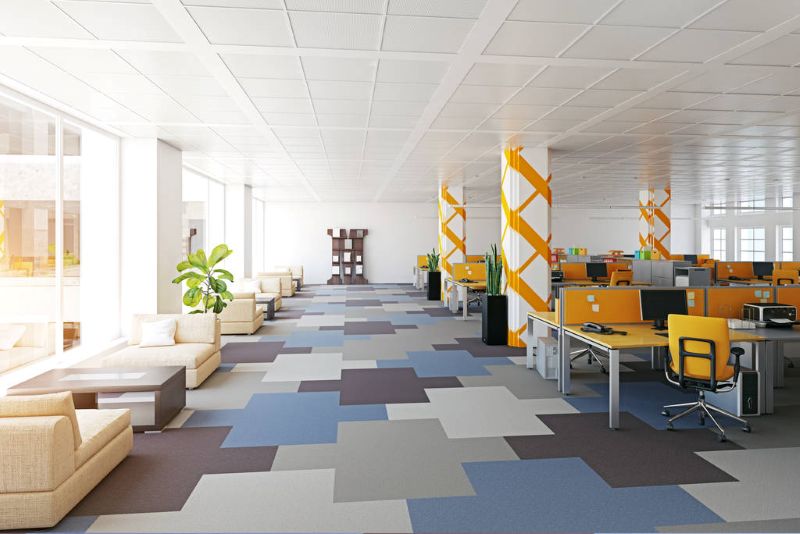
2. Shades of Gray for Professional Balance
Gray is a practical choice because it’s neutral yet modern. It works well in offices, waiting areas, or stores where you want to focus on the products rather than the walls. Light gray opens up a space, while darker gray adds depth and character.
The flexibility of gray makes it easy to pair with wood, glass, or metal accents. Businesses often use it to strike a middle ground: polished enough to look professional but not as stark as pure white.
3. Soft Blues for Focus
Blue is linked to calm and concentration. Offices and classrooms often choose lighter shades because they reduce stress while keeping energy steady. Employees tend to feel more focused in a blue-toned room.
Darker blues can suggest reliability and authority, which is why banks and consulting firms sometimes use them in client areas. Blue pairs naturally with white and gray, making it simple to build a cohesive interior design.
4. Warm Beige for Comfort
Beige is ideal for spaces where people spend time waiting or relaxing. Medical reception areas, wellness centers, and spas often use it to put visitors at ease. It feels less harsh than bright white but still professional.
The tone you choose matters. Pale beige creates a light and airy mood, while richer beige adds warmth. Combined with plants or wood finishes, it gives the space a welcoming character that works in almost any setting.
5. Yellow for Energy
Yellow brings brightness and energy into a room. It’s a good fit for creative offices, design studios, or collaborative areas where people need to share ideas. Even a single yellow accent wall can lift the atmosphere.
Bright yellow works best in moderation, while softer shades provide energy without distraction. Used carefully, yellow encourages optimism and fresh thinking in spaces where innovation is part of the culture.
6. Green for Calm and Growth
Green connects people to nature and brings balance. Businesses that want to promote wellness, such as gyms, spas, and health-focused offices, often use softer greens. These tones reduce stress and create a peaceful environment.
Darker greens communicate stability and growth, making them effective for law offices, banks, or consulting firms. When paired with natural elements like wood and stone, green can make a space feel both modern and grounded.
7. Black for Sophistication
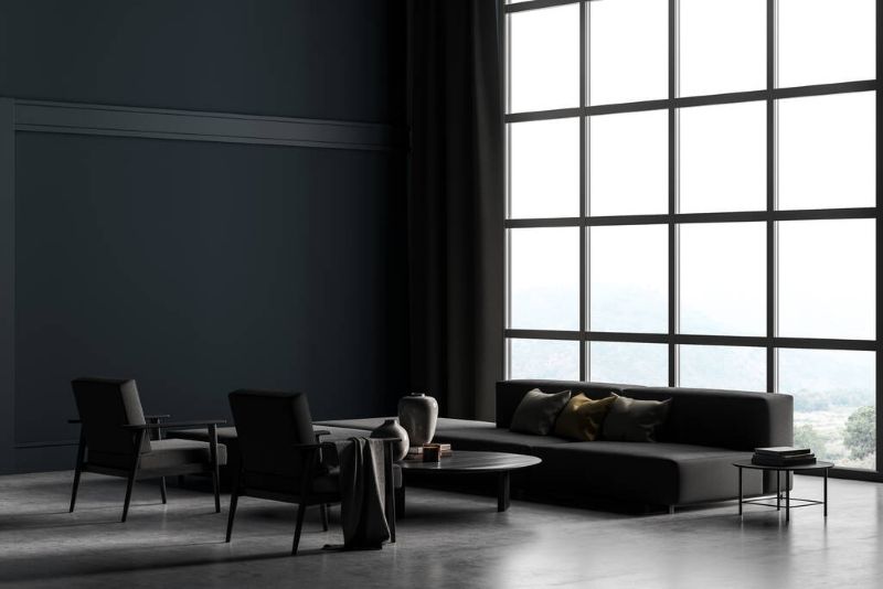
Used thoughtfully, black adds style and sophistication. Accent walls in restaurants, boutiques, or galleries create contrast and make lighting or artwork pop. Black also works well with modern furnishings and polished finishes.
Because it’s a strong color, most designers limit black to trims, panels, or single walls. In the right measure, it signals confidence and creates a striking impression without overwhelming the room.
8. Brown for Warmth and Stability
Brown tones feel natural and dependable. They’re often chosen for coffee shops, bookstores, or hospitality spaces where comfort matters. The color encourages people to linger, making it useful in customer-focused businesses.
From tan to chocolate, each shade carries a different mood. Light brown feels casual, while darker brown suggests richness and tradition. Combined with wood and leather, it adds timeless character.
9. Taupe for Subtle Modern Style
Taupe blends the coolness of gray with the warmth of beige. It’s a neutral shade that adapts to many uses, from hotel lobbies to retail floors. Businesses often choose it when they want a safe but modern backdrop.
Unlike plain gray, taupe offers a touch of warmth, preventing the space from feeling too cold. It keeps the design professional while giving enough depth to stay interesting over time.
10. Terracotta for Warmth and Personality
Terracotta has become popular as companies shift toward warmer palettes. Inspired by natural clay, it works well in restaurants, cafés, and creative studios. The color feels cozy but still stylish.
When paired with neutrals and plants, terracotta adds personality without overwhelming a room. It’s a good option for spaces that want to feel approachable while keeping a modern edge.
11. Charcoal for Modern Depth
Charcoal gray is darker and bolder than standard gray, making it useful for creating contrast. Many offices use it on feature walls or in reception areas where first impressions matter.
It suggests stability while still looking sleek. Charcoal works especially well with metallic finishes, wood furniture, or glass partitions, giving a modern but serious look.
12. Lavender for Calm Creativity
Lavender is light, soft, and calming. Wellness centers, salons, and creative studios often use it to reduce stress and keep energy steady. It’s soothing without being dull.
Compared to neutrals, lavender offers a gentle pop of color while staying professional. Combined with whites and grays, it makes a space refreshing, unique, and easy to remember.
Final Thoughts
Every color on this list carries its own effect. White opens up a space, gray balances it, blue sharpens focus, and beige comforts. Yellow energizes, green calms, black impresses, brown warms, taupe adapts, terracotta adds character, charcoal grounds, and lavender soothes.
The key isn’t just picking a color you like but matching it to the purpose of your commercial space. When the shade fits the function, employees feel better, customers stay longer, and the whole business benefits.